Film Noir Festival
*
Film Noir Festival *

Prompt
Create a print-focused brochure that explores duotone imagery, typographic hierarchy, and color control through historical visual reference.
Year
2023
Duration
1 week
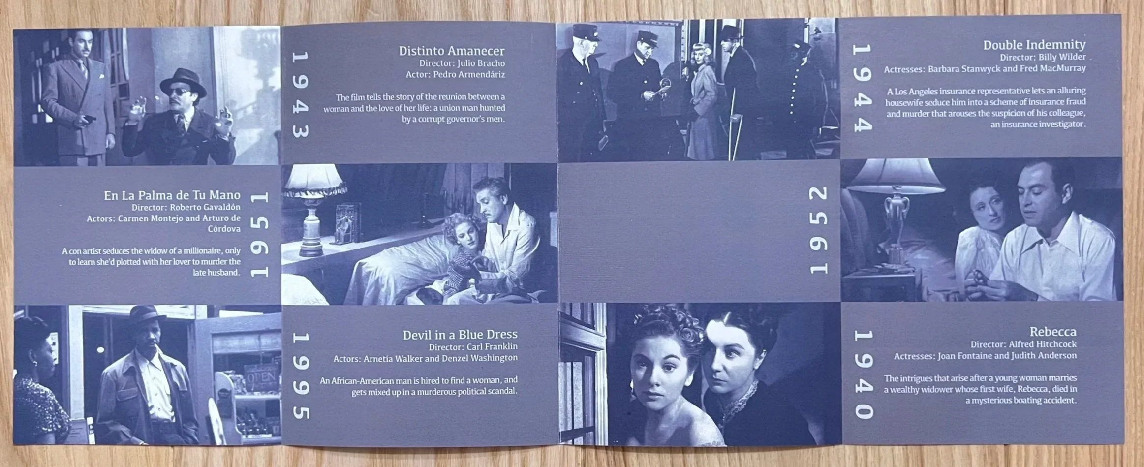
Film Noir Across Cultures
The NYC Film Noir Festival highlights classic noir cinema, emphasizing visual storytelling, atmosphere, and cinematography from the mid-20th century.
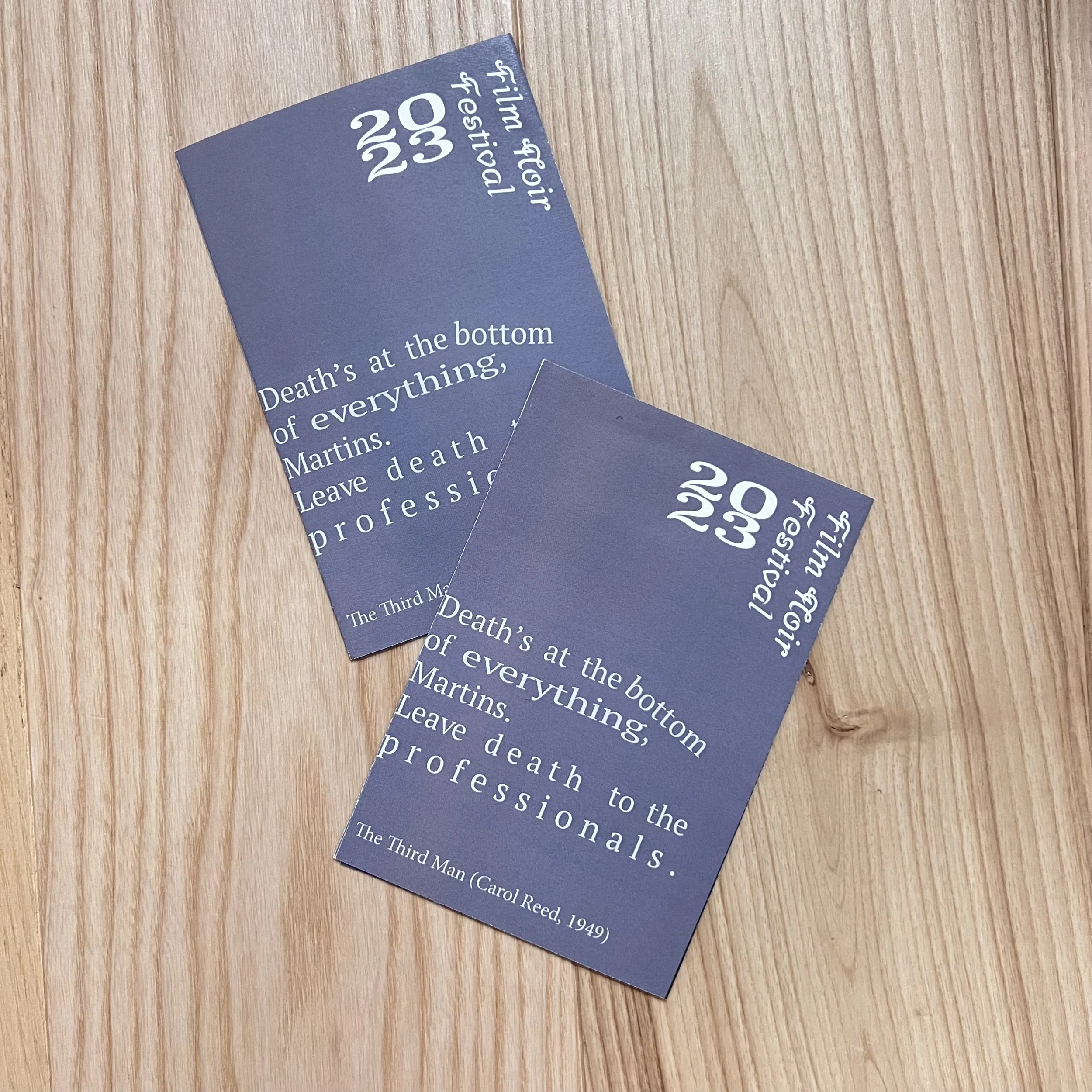
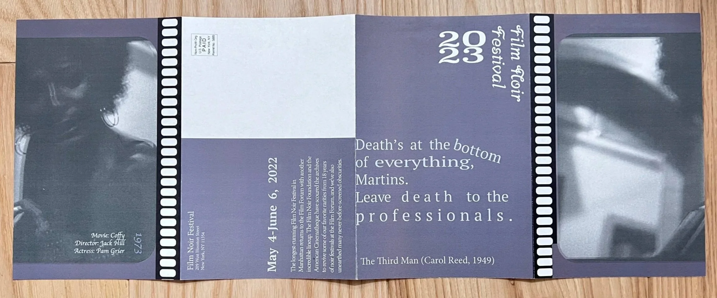
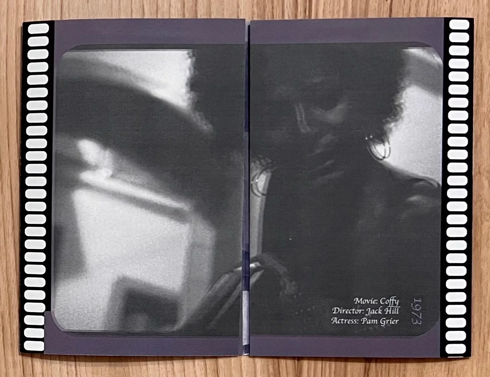
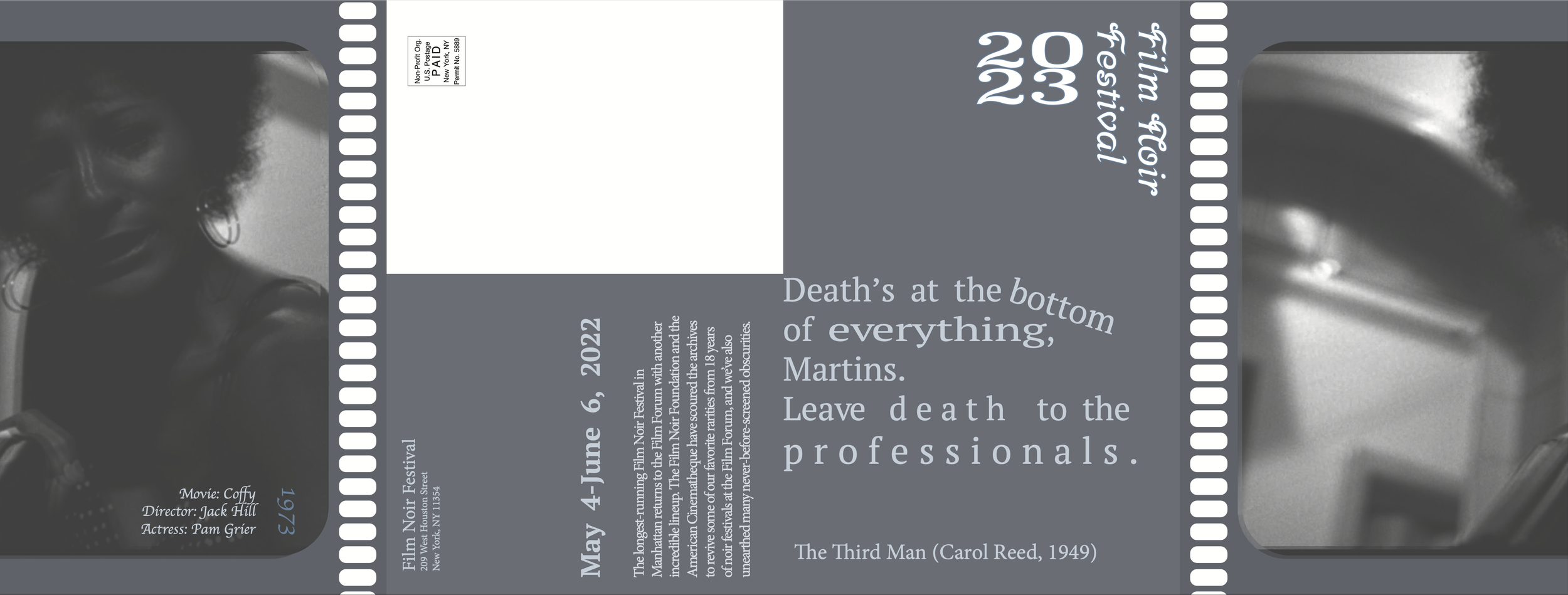
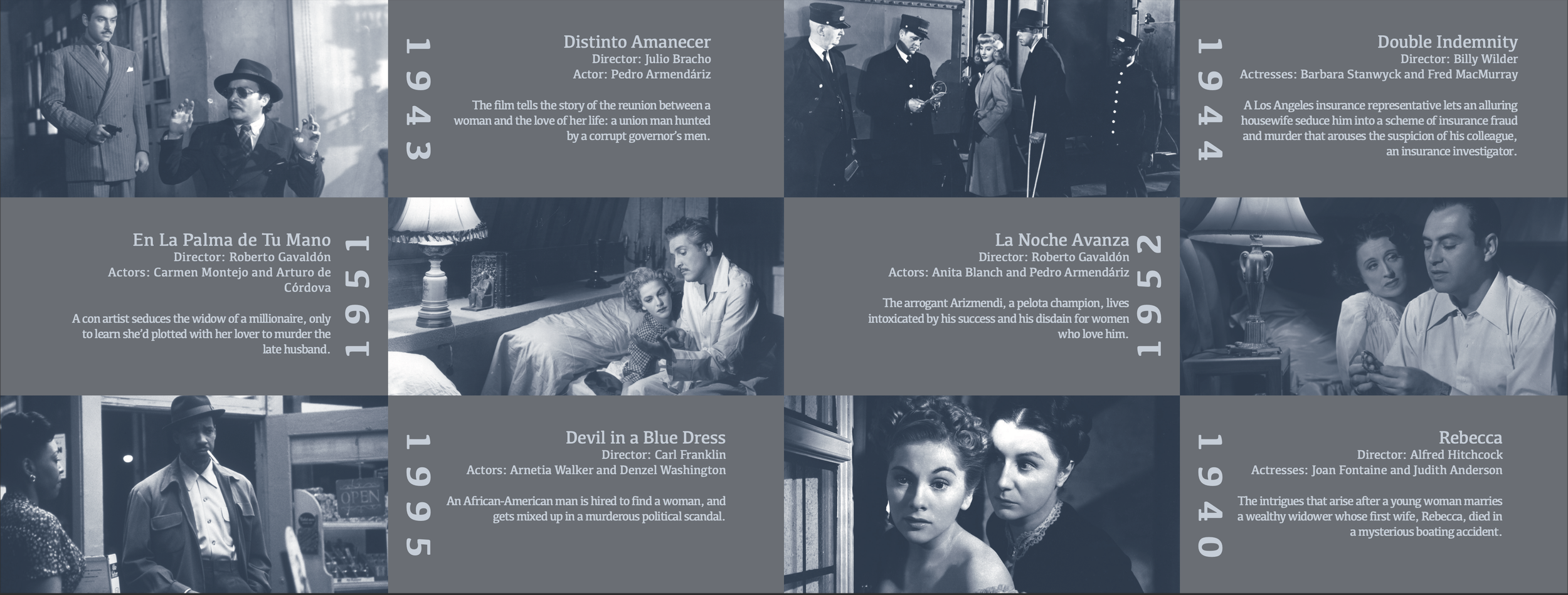
This brochure draws inspiration from early film strips and the blue-and-black duotone photographic style of the 1890s, using color theory, typography, and visual hierarchy to convey emotional restraint and strength across six iconic film scenes. Pantone Black 6 U and Pantone 542 U were selected to create cohesive greyscale and duotone imagery, with the blue tint reinforcing themes of power and aloofness. Typographic hierarchy was established through the use of Srisakdi (regular and bold) and Minion Pro, applied consistently across the front, back, mailing, and gatefold panels.
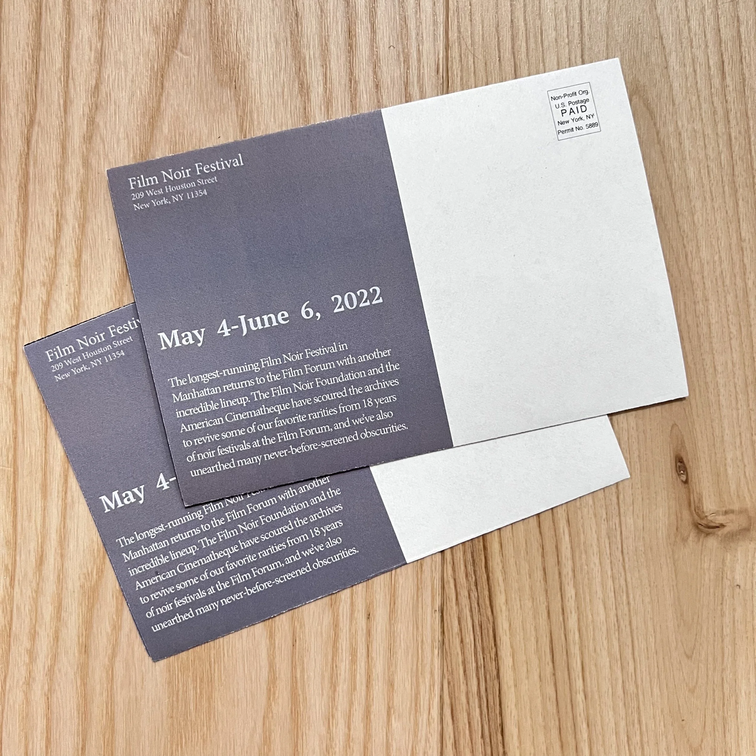
The brochure was designed using Adobe Photoshop and Adobe InDesign, with an emphasis on image treatment, layout systems, and production efficiency. Text color was intentionally softened to avoid stark white, allowing for stronger visual integration with the imagery, while the gatefold panels introduce Pantone 542 U at a 30% tint to create tonal cohesion and contrast against select dates at full saturation. This project strengthened my ability to balance concept development, technical execution, and time-constrained production within a professional design workflow.
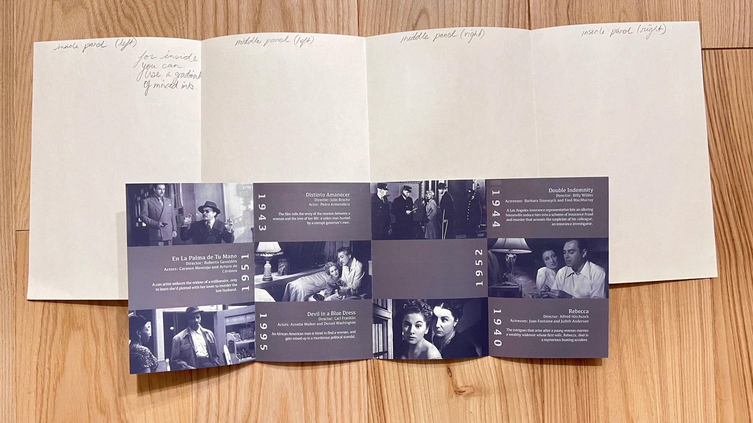
Final Brochure
Final product done (talk more about the project here what apps you used to do it)
Final gate-fold and full inner spread in blue and black duotone.
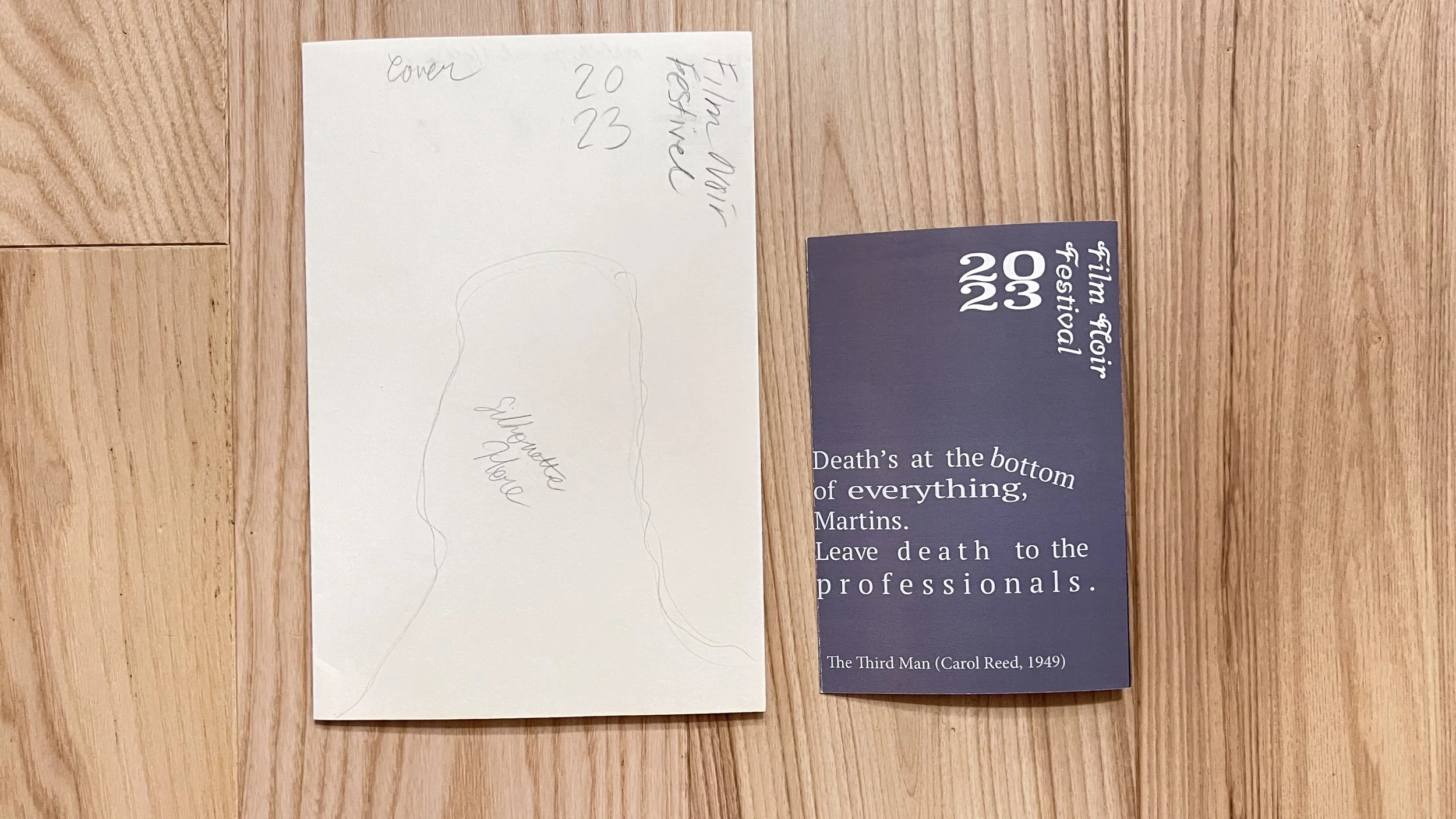
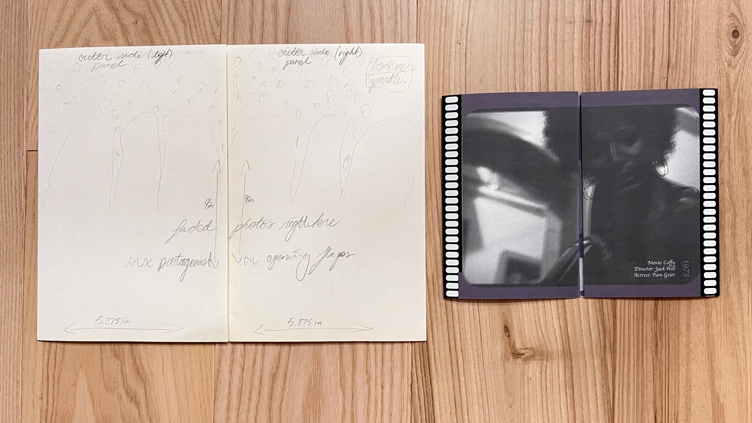
Sketching Process
Sketches of the front and back of the brochure.
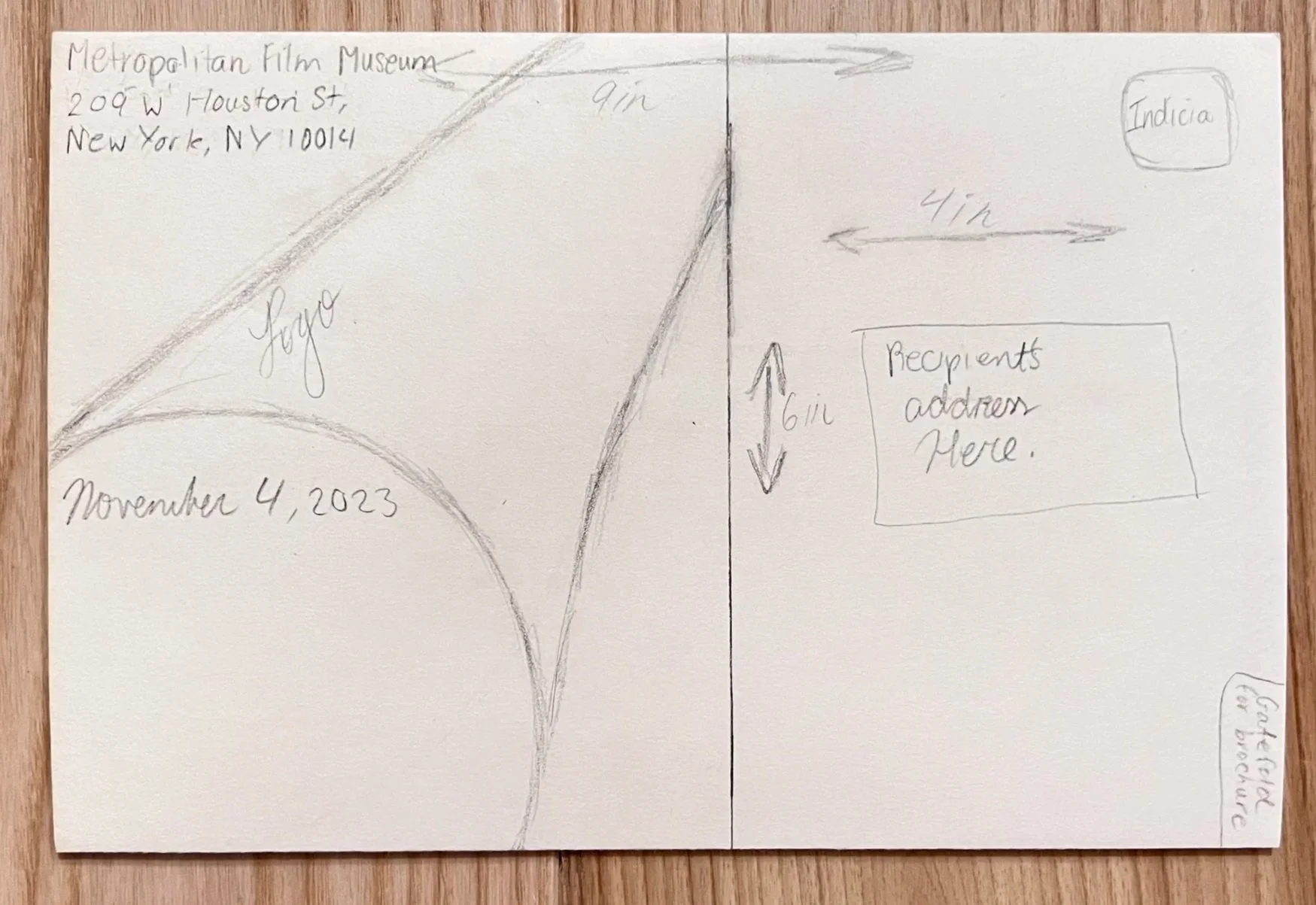
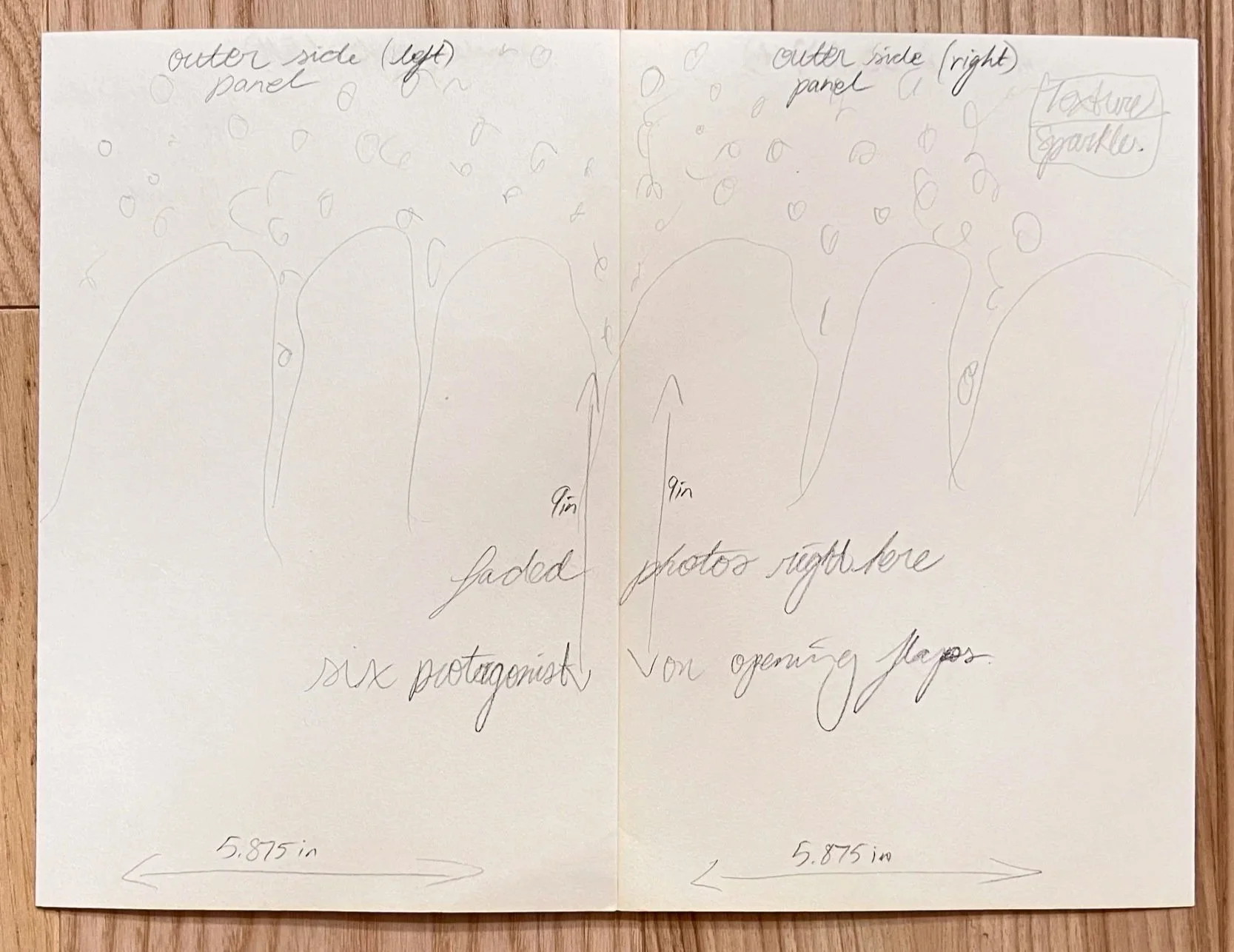
Sketches of the inner gate-fold and full spread of the brochure.
Full Spreads
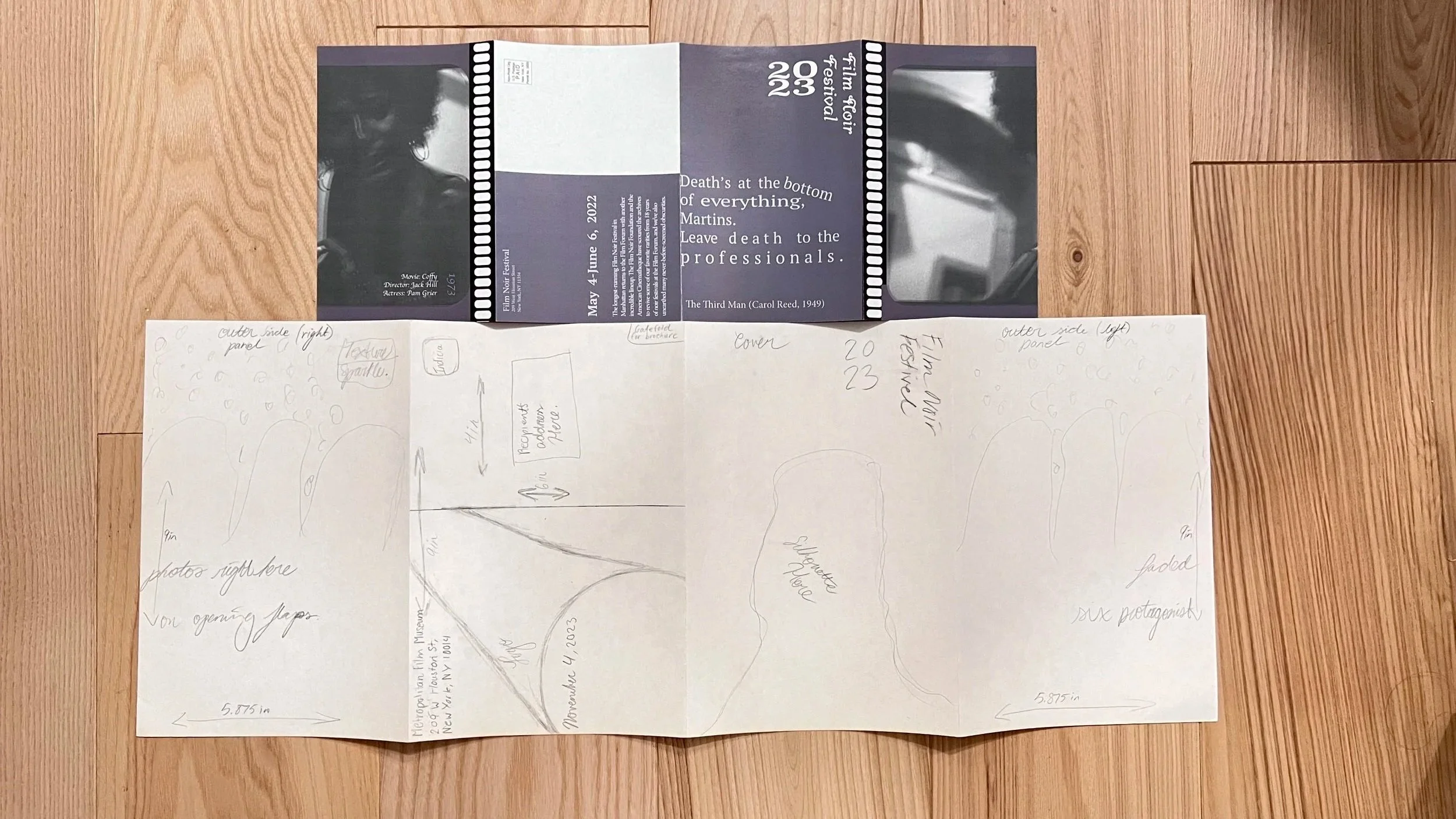
Sketches VS. Final Product